Component 2: Layers
For component 2, I have decided to respond to the theme of layers.


Claude Cahun:
Image Analysis
|
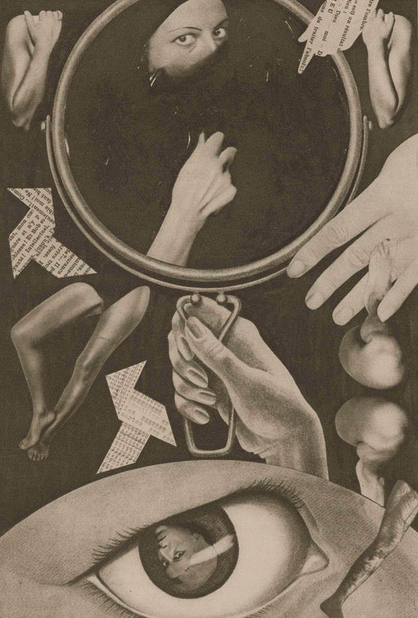
In the series of images "Disavowed Confessions" Cahun produced a number of black and white photos in a similar style to the image on the left. In the image you can see a collection of body parts, mainly hands and feet, that have been cut, and placed on a sheet of black card. Aside from the assortment of body parts there is also a hand mirror and two folded sheets of newspaper, where one appears to have normal text and the other has a sequence of letters repeated on each line. All the different body parts are in different proportions, for example the eye at the bottom is the largest part of the image and draws your attention to it straight away, whereas the legs and arms are smaller in proportion. Within the image there are also two faces at both the top and bottom of the image, the mans face, at the bottom is placed within the pupil of the eye and his whole face is visible. The woman's face at the top is distorted and you can only see her eyes and nose.
The most noticeable part of the image is the eye at the bottom which draws your attention immediately, followed by the hand mirror, the two largest components that take up the most space by occupying the central 'column' of the image. Then you begin to notice the smaller elements that are placed mainly towards the edge of the photo, and filling any empty space, like the centre of the mirror but also the left and right sides of the image. |
It is clear that the photographer has made very specific decisions in terms of the composition of all the different elements, for example, even though all the parts can be interpreted as individual elements, they all work together to create one image, with some parts being layered over or under each other. Furthermore, whilst the most obvious theme of this photo is parts of the body, Cahun has also included the parts that appear to be made of newspaper, that add to the organised chaos of the image, it is hard to know why the artist has included these parts, but they don't have a negative effect on the end product and compliment the other parts of the photo. Additionally whilst some parts of the photo are physically layered over each other, there is also layers within the individual feature, for example, the face within the pupil of the eye, this creates a secondary layering effect and gives the image more depth.
What I like most about the image is that whilst it is not symmetrical visually, the way that it is composed could be seen as mirrored. This is most obvious in the top corners with the two arms, however, it can also be seen where the photographer has used mainly circular images for the middle and used very similar elements on either side, such as the two pairs of legs on both sides of the central hand. Also, I like how the artist has brought extra attention to the arms and legs by having them all posed, they haven't just taken any image, but selected them where the arms or legs are making unique or interesting shapes.
What I like most about the image is that whilst it is not symmetrical visually, the way that it is composed could be seen as mirrored. This is most obvious in the top corners with the two arms, however, it can also be seen where the photographer has used mainly circular images for the middle and used very similar elements on either side, such as the two pairs of legs on both sides of the central hand. Also, I like how the artist has brought extra attention to the arms and legs by having them all posed, they haven't just taken any image, but selected them where the arms or legs are making unique or interesting shapes.


Micheal Muraz:
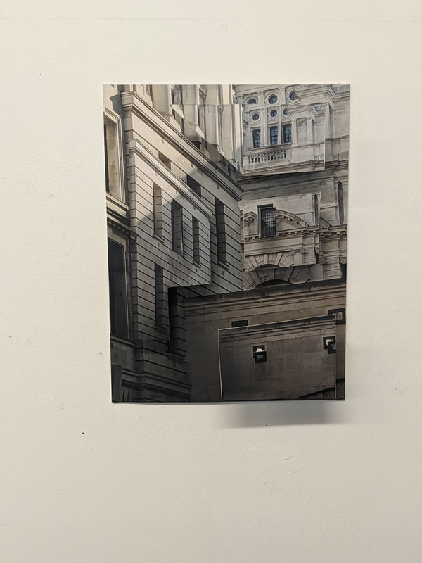
Micheal Muraz is a photographer that creates images with a layered effect by taking photos of different buildings stacked behind each other, when compressed into a 2D photo it creates the effect that the buildings have been collaged by hand, so the photographer has to be very specific with the composition to create an artificial-looking image.


My Personal Response
For my response to Muraz's work, I went to central London to take my photos. I was looking for specific buildings which had layers within the individual building, and then further layers when shot with the surrounding buildings. I think that some of the most effective images are the ones with only one colour, whilst they are monotone, I feel like it makes them feel more abstract as you cant see where one building ends and the next starts. Furthermore, I like how the images look isometric as if they have drawn or edited rather than just a simple photograph.


3D Layering Project
For the refining process of my Michael Muraz response, I selected the most successful of the above images and decided to make it into a 3D model, to add a layer of dimension as well as creating it in physical layers of card. This will result in the final part of my response, which started as the three dimensional buildings, then was compressed to form a 2D photo, which was then later reconstructed as the 3D model, before it was showcased as a two dimensional photo on my website.


The first step was to use adhesive spray to stick the printed image (A3) onto mount board, I then printed two extra copies of the same image (A4) and did the same thing. I then chose some of the parts that I thought were the most interesting and cut these out of the A4 copies. I used some spare mount board constructed into rectangles to heighten these isolated parts at different heights. I then did this again but for the already heightened parts to create a third layer.
Nobuhiro Nakanishi


Nakanishi is a Japanese artist and photographer who specialises in printing on glass. His layered glass exhibitions use multiple of the same or similar photos, with the purpose of showing movement or change over time. For my response I want to show changes in light level, or if not a landscape, movement such as dancing which would have an interesting affect once layered.
My planned response to Nakanishi was to use a selection of photos showing the movement through a simplistic dance routine, obviously I would have no access to glass to make my layers, so planned on using acetate to create a similar effect. However, when trying to print on acetate using an inkjet printer, the results were poor and the images were undefinable.
Cubism: Pablo Picasso
Cubism was a revolutionary art style developed and used by Pablo Picasso in the early 1900s, where artists constructed an image from multiple viewpoints of the same object or theme. This style was very successful in terms of abstract art, and I plan on incorporating this art style into the theme of layers, whilst continuing to refine my work responding to Micheal Muraz


Cubism Response
To start my response I took a series of approximately 30 photos, all taken from different heights, angles, and perspectives, trying to replicate how Picasso created his portraits by looking from different points of view.


The next stage was to start importing the images to photoshop. I chose an image that I wanted as the base photo, aiming to build up the layers on this photo, and following the main outlines and shapes. To start altering the images, I imported the next photo and used the lasso tool to isolate the part of the photo I wanted to layer. My first decision was to start with the face, as it seemed the most intricate part, and the most sensitive part; I wanted the face to look distorted and abstract, but still with all the identifiable features such as nose, mouth, eyes, ears, and hair. I then moved on to the rest of the body, trying to replicate the dominant shapes and features. This process was slightly easier as the details didn't compare to the intricacy of the face. The final part of the photoshop process was to alter the background, I didn't want a block colour background as it made the image appear incomplete. Instead I took a selection of all the other images, where all the colours were slightly different to each other because of the light and shadows. To contrast the foreground and background, i tried to have any layers in the background be larger and more angular compared to the person.


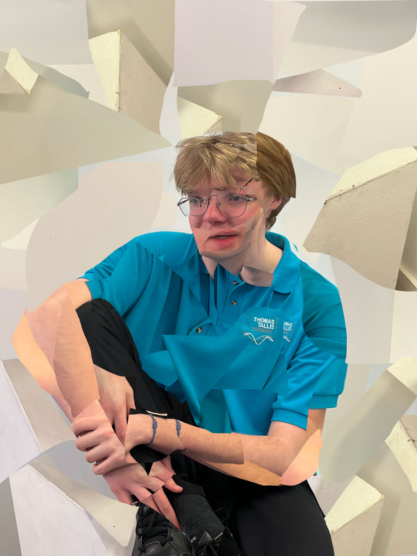
This image is the final product of the photoshop process. Overall I am happy with the photo and I think that it is a successful response to the ideas of both 'cubism' and 'layers'. In my opinion, this image is most similar to 'the portrait of Pablo Picasso' (the blue image above used as a reference). This is because the head and body are the most intricate parts, using a combination of smaller smooth and angular segments, whereas the background users larger pieces which are more angular with straight edges. I accomplished my main goal which was to have all main distinguishable features visible and identifiable. I also am happy with the contrast between the fore and background, and I like the smooth edges of the subject so that it is still easy to interpret where the different parts of the body start and end. One of the main things i was concerned about was the repetition of certain parts, such as the bracelet, however I think this helped to make the image feel as if it were constructed from multiple different perspectives, rather than just one which was cut out and rotated. Overall I am happy with this Image.
Stewart Nelson
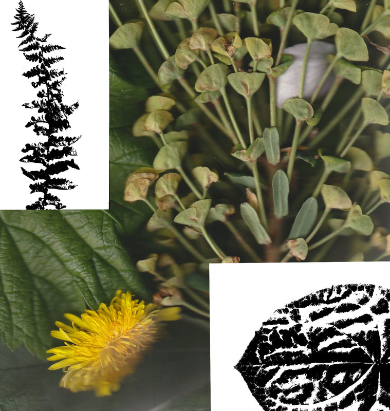
Stewart Nelson is a photographer that uses scanography, mainly with plants, to create his images. For my response, I definitely wanted to use a scanner, as I haven't done this style of photography in the course yet, and I also wanted to stick with the idea of plants, however using multiple components aswell as singular ones.


For my initial scans I used a selection of leaves and flowers that I had collected:


The next stage was to actually incorporate the layering aspect, so using the components collected above, I constructed the next part of my response.


I was already quite happy with a couple of these images, but to refine them even further, I put the best ones into photoshop to refine them further.


This photo was my favourite out of the final products after photoshopping, I created these by adding photos over each other and merging them into 1 layer, then I changed the threshold to produce a black and white image, that still showed enough of the defining details. I then used the fill tool to add a block colour, the last stage was to adjust the layer to produce the desired effect. Even though there is a lot of contrast between the colour and black and white in my chosen favourite, I still like the effect it provides, making it look like separate images, using separate techniques really falls into the idea of layering.
Making Day Plan:
Throughout the 10 hour period, I will be making another 3D constructed piece, using stacked layers of mountboard to create a visually appealing result, I may also explore with other resources such as acetate or gel to include transparency within the layers.
