Make
|
Make do and mend is a saying that developed in WW2, it meant: do what you can with the stuff you have, and mend stuff that is broken instead of buying new stuff.
This relates to the current time as we are restricted to certain rules and instruction because of the virus, we are restricted to the classroom and there are different procedures to make sure everyone is as safe as possible. This means we have to look from different perspectives and make do with what we have, and find new solutions. Having restrictions could help us because it could help us to look at different point of view and use it to our advantage. This can relate to the school habit of imaginative, and the school character of optimistic. |


Choices
We are looking at choices so we can understand more about constraints, we need to know all the choices we make and with instructions we understand how it feels to not be able to do as we want, we have to follow the rules.
- What to take a photo of,
- When to take the photo,
- Where to take the photo
- From what angle do you take the photo,
- Where is the source for the lighting in your photo
- How high or low will the shot be taken from,
- What to focus on,
- What is in, and what is out of the shot,
- How close are you to the subject of the photo,
- Select the type of photo, black and white or colour,
- How much you zoom in,
- If you are on a phone what do you pick, portrait, square, pano, etc...
I received the following instructions from a classmate:
- Open the camera app
- Select square
- The subject is the wrapper from some sweets or chocolates
- Make sure there is good overhead lighting
- Make sure you focus on any writing, text or design
- Make sure there is no background, just the item
- Take the photo in colour, not black and white
- When you are happy, take the photo at a slanted angle
These are some photos I took:


WWW: |
EBI: |
|
|
Marcel Duchamp - The readymade
|
Who was the Mona Lisa?
Leonardo’s painting was of the Mona Lisa, she was the wife of a Florentine merchant. The reason it may be so famous could be because of her facial expression. It is an interesting expression because it could be interpreted in different ways. How did Duchamp change it? Duchamp’s work is a postcard of the Mona Lisa, however he changed it by adding a “graffiti” moustache and goatee. The title: L.H.O.O.Q, translate to the phrase: she has a hot ass. It became famous because it was one of Duchamp’s most successful pieces in his category: the ready-made. 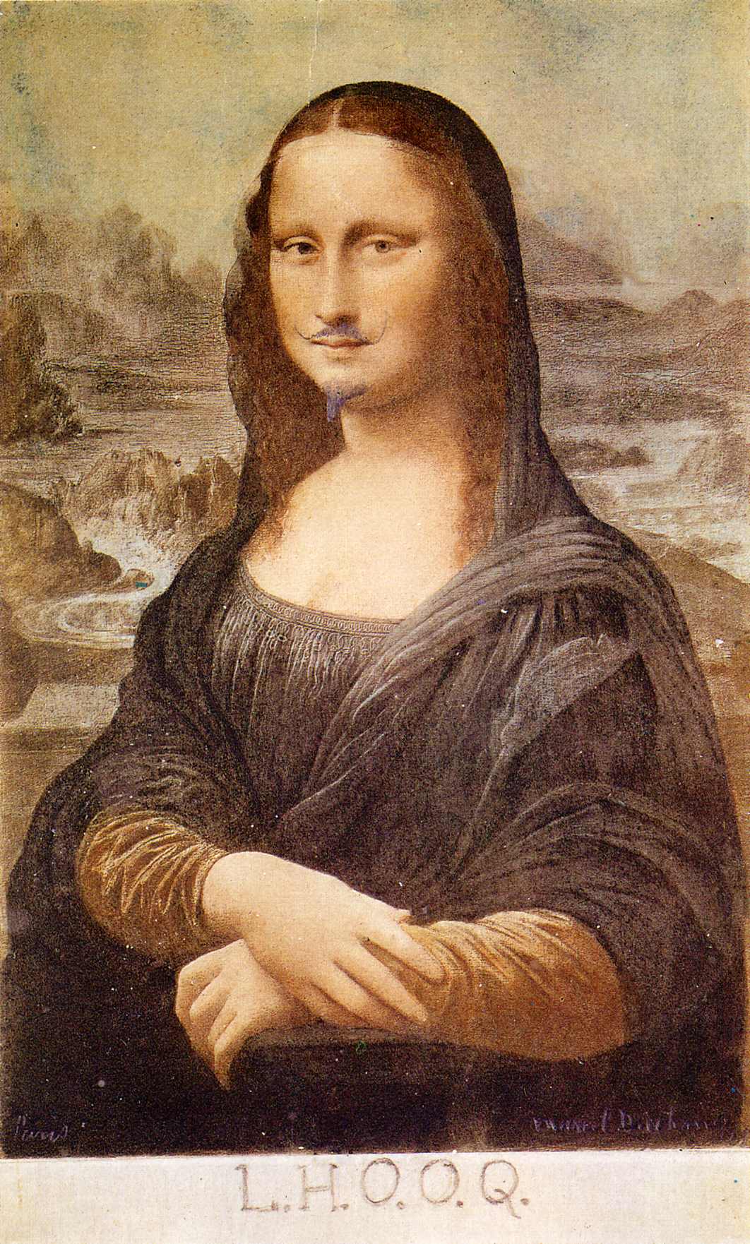
|
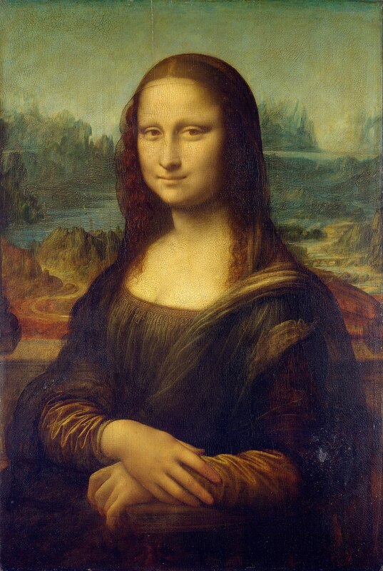
Leonardo Da Vinci's Mona Lisa-1503 (above)
Marcel Duchamp's L.H.O.O.Q-1919 (below, left) How is Duchamp's work readymade? L.H.O.O.Q is readymade because Duchamp took a cheap, mass-produced postcard and altered/changed it a very small amount to create a completely new piece of work. Why do artists like the idea of the readymade? Because it meant that you could create hidden stories, alternative meanings, and different interpretations to a simple object, thing, or an existing piece of art |
Kensuke Koike


The work above is done by Kensuke Koike, he is a Japanese artists who plays on how things look. A lot of the time he cuts parts out and rearranges them to look funny or strange, taking inspiration from his work we did are own, in a similar way.
To respond to Marcel Duchamp's : L.H.O.O.Q, and Kensuke Koike's work, we decided to take photos from and old book and change them.
My Readymade Experiments:
Attempt #1


WWW: |
EBI: |
|
|
Attempt #2


Hannah Höch's 'Beautiful Girl'
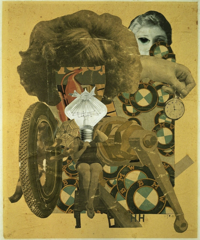
Hannah Höch - Das schöne Mädchen (The beautiful girl) 1920
There are lots of different elements in the photo. The main ones are a woman’s body parts and a dismantled car. A large proportion of the photo is a woman's hairdo, with the face cut out. There is the body of a woman at the bottom, and a hand in the top right holding a gold pocket watch. There are also elements of a car such as several BMW logos (a German car company). A large wheel is present, and some sort of machinery, possibly some sort of piston. The collage of photos is effective because at first glance you can't interpret what is human and what is machine. For example, the piston could be a leg, sticking out from the side.
In my opinion, the lightbulb in the centre of the picture is the most “stand out” part. Firstly, it is a bright white colour, whilst the rest of the photo is stained a yellow/muddy colour. Maybe this could represent something. Also, it is the most central object, which is often the first place you look. However, the hairdo in the top left could also be significant; it is the biggest element, visually, and could in turn attract a lot of attention.
The two main types of image are: disassembled parts of a female body, and several parts of cars. They most probably came from magazines, a fashion magazine, maybe, and a car magazine. This could link between the struggles of women in society at this time and the industrial revolution, which in Germany started in 1870. The main visible parts of the car are the weel, the logo, and the piece of machinery.
The title “the beautiful girl” could also represent that to be a “beautiful” woman, doesn’t mean to “wear a dress” or “have nice hair”. It could show that even a woman working in mechanics or manufacturing can be beautiful. If I had to make a new title, I would change it to something more expressive, where you don’t have to read between the lines, but something that shows you are confident.
My three adjectives would be:
The three questions I would like to ask the artist are:
In my opinion, the lightbulb in the centre of the picture is the most “stand out” part. Firstly, it is a bright white colour, whilst the rest of the photo is stained a yellow/muddy colour. Maybe this could represent something. Also, it is the most central object, which is often the first place you look. However, the hairdo in the top left could also be significant; it is the biggest element, visually, and could in turn attract a lot of attention.
The two main types of image are: disassembled parts of a female body, and several parts of cars. They most probably came from magazines, a fashion magazine, maybe, and a car magazine. This could link between the struggles of women in society at this time and the industrial revolution, which in Germany started in 1870. The main visible parts of the car are the weel, the logo, and the piece of machinery.
The title “the beautiful girl” could also represent that to be a “beautiful” woman, doesn’t mean to “wear a dress” or “have nice hair”. It could show that even a woman working in mechanics or manufacturing can be beautiful. If I had to make a new title, I would change it to something more expressive, where you don’t have to read between the lines, but something that shows you are confident.
My three adjectives would be:
- Chaotic – It is complex and difficult to interpret
- Feminist – It shows the struggle of women in society.
- Personal – It may be the artist’s way of expressing how she feels during her lifetime.
The three questions I would like to ask the artist are:
- Why represent your thoughts about feminism through the link of cars and women
- What does the pocket watch represent?
- Is the woman in the photo linked to you or the cars in any way?
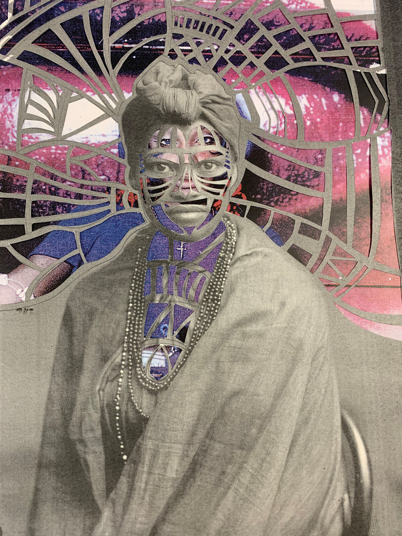
Sharon Walters
Sharon Walters is a London-based artist who creates hand-assembled collages celebrating black women. The series, entitled
'Seeing Ourselves',explores under-representation in many arenas in particular, the Arts and Heritage sector and mainstream western media.
The work encourages us to 'take up space', be seen and create our own spaces.
Since graduating with a degree in Fine Art from Central St Martins (University of the Arts) in 2011, Sharon has developed her practice and continued her work with community arts organisations and museums, using them as platforms to explore and collaborate with the voices of those who are often unheard.


The images above are the work of Sharon Walters, who focuses on cutting out a design, and then puts it on a previously made photo to create a background, which you cans see through the cuts.
The pictures below are my own re-creations, using the same style.
The pictures below are my own re-creations, using the same style.
|
WWW:
|
EBI:
|
Matt Lipps
Matt Lipps is an American photographer an artist, he has a recent series of work called "looking through pictures", which involves pictures of models, flowers, sculptures, and architecture, and he works in subjects such as sculpting. He uses negative space, and makes essentially " 3D collages".


To live a creative life, we must lose our fear of being wrong"


Daniel Gordon
Daniel Gordon is an American artist and photographer, he produces large colour photographs. Described in a 2014 New Yorker review as an artist who “makes Matisse look like a minimalist,” Gordon creates works that dissolve distinctions between collage, photography, and sculpture.


|
I chose these images because they stood out, not necessarily because of the bright colours, but because they may represent a mood. For example the blue one could represent sadness, because blue is a cool colour, this could link to other artists work such as Picasso's "blue period"
In the images there are a lot of elements linked to nature such as the flowers and the plants, and in the green one there are more fruits as well, once again linking to elements from natural sources. However there are also man-made objects such as the clay pots. this could be to do with the links between humans and nature, or could be to emphasise the mood/theme. In my opinion I think that the pot with the flowers is the most "stand out" part of the photo this is because it is not only the biggest element in the picture, but it is also the part that is emphasised, because in the background you can see the silhouette or outline of the flowers. |
A professor once said that you have to build something up until it's undeniable." |
|
Three words i would use to describe this are:
|
Three questions i have are:
|
Hannah Hughes
Hannah Hughes is an artist working with collage, sculpture, constructed photography and
moving image. She graduated from the University of Brighton in 1997 and has since exhibited in
the UK and internationally. Her work has been published in the FT Weekend Magazine, Art Licks Magazine, the RPS Journal, and the British Journal of Photography.
moving image. She graduated from the University of Brighton in 1997 and has since exhibited in
the UK and internationally. Her work has been published in the FT Weekend Magazine, Art Licks Magazine, the RPS Journal, and the British Journal of Photography.


If you see something beautiful in some one, speak it"
|
I chose the picture on the right because, like a lot of Hughes' work, it has a simple but effective design. It uses cool colours, such as greys and blues. Cool colours are often used to show sadness, but could be used just because they work well with each other and are very relaxing.
|

|


Abstract Advent
|
During the run up to Christmas we will be doing a project called abstract advent, which was designed by Chris Francise. Every day until Christmas Eve, we will take a photo based on the image on the right. The images will be shown in the gallery below.
|

|


Collaboratives Instruction Based Collages
Today we had to create collages out of pre existing photos, here are the instructions:
- Cut or tear out 5 pages from your magazine. Choose pages with interesting images.
- Make a pile of these 5 pages on your desk.
- Take the top page and cut a hole in it (Note: it doesn't have to be perfect).
- Pass this cut out image to your neighbour (the person sitting nearest to you in class).
- Put the page with the hole in it at the bottom of your pile.
- Take the (new) top page and tear it in half. Pass one half to your neighbour (the same one as before) and put the other half at the bottom of your pile.
- Take the (new) top page and cut out a shape (Note: you could cut round an object or simply cut a random shape of your own choosing).
- Keep the cut-out shape, putting it at the bottom of your pile, and pass the page that remains to someone 3 places away (Note: make sure you don't end up with your own page).
- Take the (new) top page and tear a strip from the (top or bottom) edge. Keep the strip and pass the remaining page to someone else in the room.
- Place the A3 sheet of cartridge paper in front of you (portrait format).
- Without altering them, arrange the pieces of paper from your pile on the A3 sheet to create a pleasing collage. Carefully photograph your first arrangement.
- Again, without altering them, repeat this process, re-arranging the various elements on the A3 sheet until you are happy with the results. Photograph carefully.
- You may now swap 1 or 2 elements with your neighbour. Make a new arrangement and photograph carefully.
- You may now adapt the pieces in any way you like - cutting, tearing etc. Make a new collage, this time sticking them to the A3 sheet of cartridge paper.
- Photograph your finished collage carefully.
- On your Make Do and Mend web page add the title Collaborative Instruction Collage.
- Copy and paste this list of instructions.
- Add a Gallery and upload the images you have taken today of your collages.
- Write a brief evaluation (WWW/EBI) reflecting on what it was like to make a collage by following instructions and how you feel about the results.
- If you complete all of this, experiment with importing the photographs of your collages into Photoshop and experiment with manipulating them using the various tools available. Remember to take screen shots (Cmd + Shift + 4, then draw a box) of the process so you can also add these to your webpage. Also, remember to save the resulting images as Jpegs (File > Export > Save for Web, select Jpeg High) and add them to your websites.
Here are the photos before we changed them:


Here are the photos after we followed the instructions


|
WWW:
|
EBI:
|
Prison Photography
Klavdij Sluban
|
|
1) Why does the photographer choose to work with teenage prisoners?
i think that by working with younger prisoners he feels like he is giving them a second chance, he is giving something to inspire them for when they leave prison.It could give them a positive mindset and set them on the right tracks for their future. 2) What does the photographer exchange with his students? The luxury of dealing with art everyday, he gives them new opportunities and new ideas to open there imagination and bring out their creative side. |
|
3) What kind of camera do the inmates use to create their pictures?
They use single use cameras with a limited number photos each. This helps them to think carefully as there are only so many chances you can have. This might teach them to think before they act and not repeat previous mistakes. 5) What benefits do the workshops give the prisoners? It gives them something to think about that makes it so they are not restrained by bars or walls, but they have more freedom if they choose to use it. |
4) Why does he think that photographing nothing is interesting?
It helps give them more perspective, so they have different interpretations that exercise their imagination. |
Nicolò Degiorgis
|
Degoirgis is an Italian artist and writer who was born in 1985. He was the author of a book named 'prison photography' that was published in 2017. In his book he has photos taken by prisoners over a range of photography genres. In total there are 137 photos, all in black and white for a monochromatic effect.
|

|


Photo Treasure Hunt #1
|
|
RULES
|


Photo Treasure Hunt #2
|
RULES
|


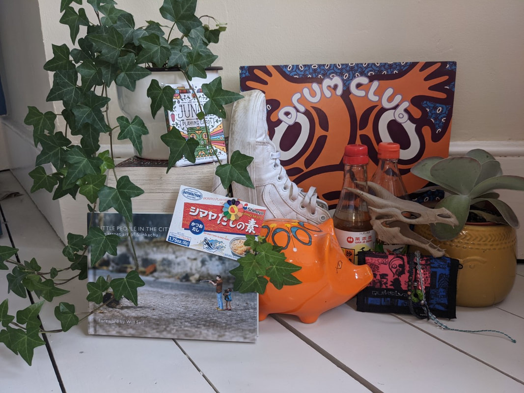
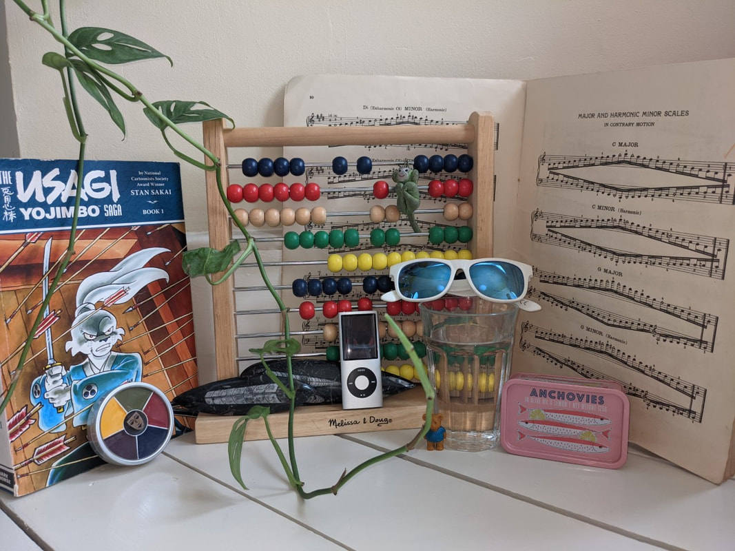
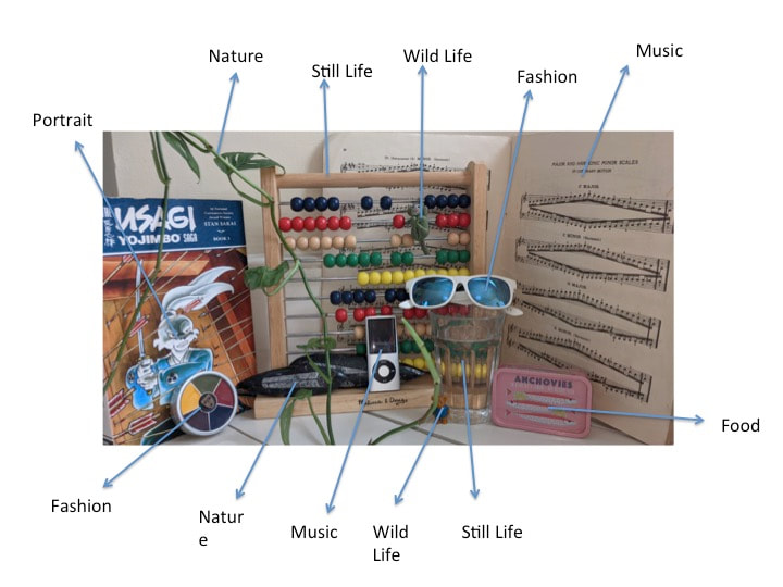
Genres in Photography
Today we were set a task to create a staged photo, with as many genres as possible.
Here are my original photos
Here are my original photos
|
|
And here they are with labels...
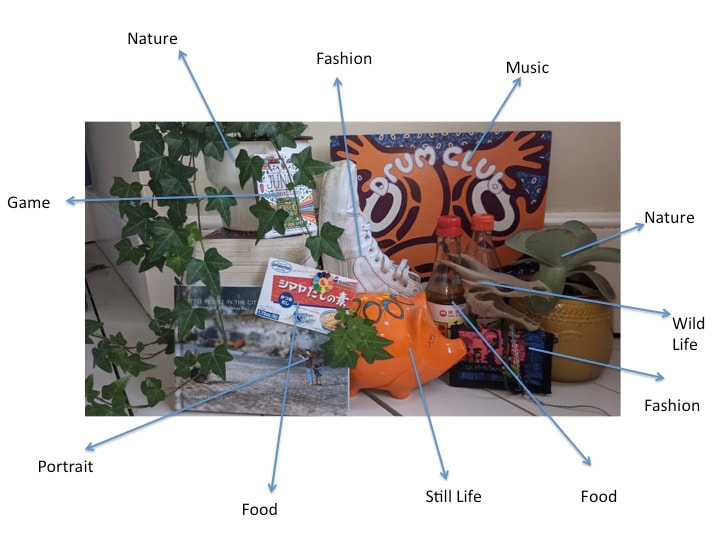
|
|
Holidays at Home
For obvious reasons, we cannot go outside and explore the world around us, so for a couple of weeks we've been using google maps to find and discover new place. Next we screenshot something that may look interesting or appealing, to make a gallery of our work.
For example: We had a school "field trip" we used google maps-street view to visit a remote island in the Pacific Ocean named Bora Bora, we walked around to find interesting scenes to add here.
For example: We had a school "field trip" we used google maps-street view to visit a remote island in the Pacific Ocean named Bora Bora, we walked around to find interesting scenes to add here.


These are the images i found in Bora Bora, the first one is very idyllic and makes you think of a holiday catalogue, whereas the others show more off-road holiday vibes. if you look very closely at the images you can often see small glitches where the picture doesn't fit correctly, however these are the only giveaways and if you only look briefly you might believe they are real.
After our trip to Bora Bora I decided to visit another holiday destination: The Great Barrier Reef in Australia, not so much street view now, but there are certain locations where you can see through the perspective of a diver and delve underwater to see what you can find...
After our trip to Bora Bora I decided to visit another holiday destination: The Great Barrier Reef in Australia, not so much street view now, but there are certain locations where you can see through the perspective of a diver and delve underwater to see what you can find...


After 2 luxury holiday destinations, i decided to visit somewhere that not many people seem to talk about: I went to El Alto, a Bolivian city which translates from Spanish to - The Tall, this is because the city of el alto is 4150 metres above sea level. Im not here for the height though, i'm here for a series of building named The Cholets. They are designed by Freddy Mamani - A Bolivian architect, The Cholets feature bright colours and intriguing shapes.


Daidō Moriyama
Daidō Moriyama is a Japanese photographer, his work focuses the darker sides of urban life and the less-seen parts of cities. Over his time working as a photographer he has produced a collection of photos named Nippon gekijō shashinchō. Moriyama's work is almost always in black and white, with high contrast and a grainy resolution. Here are some examples:


Based on his work, I explored the streets of Tokyo, to see if I could find something that I think Moriyama would've taken a photo of. Bearing in mind, he took his photos in real life, and I am only using google street view. Here are some of my photos:


Because street view is produced by a camera mounted on a car, it means I am more restricted and can only take photos from the road. This makes it harder to explore areas Moriyama would've been able to.
Collaborative GSV Project - Venice, Los Angeles
Today we explored the streets of Venice in Los Angeles, each with a specific quota to find, mine was street art/graffiti. These are the 12 photos I took:


These are the photos I'm going to edit:
These are the photos once edited:


